How to Implement Dark Mode with Tailwind v2.0
Braydon Coyer / December 21, 2020
12 minute read
•
--- views

Dark mode. This design trend has almost become expected by most users with websites and web applications. Dark mode has been possible to integrate with Tailwind projects, but required some workarounds utilizing CSS variables and the config file got messy and hard to read. With Tailwind v2.0, dark mode is built right into the framework and removes the need to work with those pesky CSS variables!
In this article, I'll show you how to get dark mode working in a React application (stick to the end - I'll give you a starter template!). Even though this is done in React, the main ideas apply to all modern JavaScript frameworks.
Let's get started!
I acknowledge this is a long article, so I'll give you a summary.
Tailwind v2.0 gives us the flexibility to choose how we want to implement dark mode. If we want full control, Tailwind will look for an element in the DOM with the dark class attached to it. If the element is found, elements styled with the dark variant will be applied.
Here's an example of styling a component with dark mode :
1<div class="bg-white dark:bg-gray-800">2 <h1 class="text-gray-900 dark:text-white">Dark mode is here!</h1>3 <p class="text-gray-600 dark:text-gray-300">Lorem ipsum...</p>4</div>It's up to us to supply the functionality that dynamically adds/removes the dark class to a top-level document element. In this tutorial, we utilized the Context API to expose a theme variable and a function to change the value. When the value is changed, it triggers a function in a component called ThemeProvider that adds/removes the dark class on the root document element.
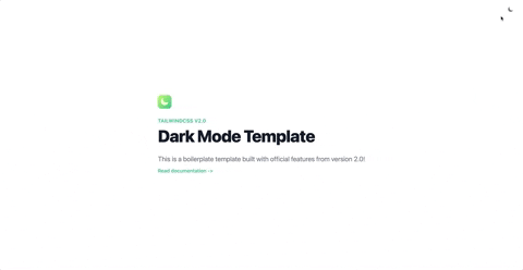
Want to see the finished code? Check out my starter template HERE!
Here's a preview of what you get with the template:
Still here? Cool!
I prefer to break features down into manageable tasks before I begin to work on them. It helps me understand requirements, identify and pain points and better think through the problem.
The first thing we should figure out is how Tailwind wants developers to work with the new dark mode feature.
According to the documentation, Tailwind v2.0 now includes a dark variant. This means that you can style your elements as you normally would, and for those elements that you want to alter their appearance in dark mode, you simply add the 'dark' variant in front of the style utilities. You can chain them too, which is pretty neat. Here's a basic example of styling an element with both light and dark mode:
1<div class="bg-white dark:bg-gray-800">2 <h1 class="text-gray-900 dark:text-white">Dark mode is here!</h1>3 <p class="text-gray-600 dark:text-gray-300">Lorem ipsum...</p>4</div>Styling elements with the dark variant won't actually do anything until dark mode is enabled in the project.
In the tailwind.config.js file, we can include the darkMode option to enable the feature in Tailwind.
It's important to note that there are two values we can use here - media and class.
The media value uses the prefers-color-scheme media feature to detect if the user has dark mode selected as their appearance preference. This is the easiest option and doesn't require any additional set up to get working. Simply set the value to media, styles your elements with the dark variant, and you're good to go!
1// tailwind.config.js2module.exports = {3 darkMode: "media",4 // ...5};On the other hand, if we want to include a manual appearance switch on the web application, we can use the class value. Since most websites and applications allow us to switch dark mode on or off (usually with a toggle), this is that value we'll use in our example (and we'll manually use prefers-color-scheme just for the fun of it!). Because this option doesn't do any of the heavy-lifting for us, it's our job to implement the toggle functionality.
1// tailwind.config.js2module.exports = {3 darkMode: "class",4 // ...5};Continuing the thought above, in order for the dark mode styles to take effect, Tailwind searches through the DOM for an element with a dark class applied to it. If it finds that element, all of the dark variant style utilities will be applied.
Now that we understand how Tailwind wants us to work with dark mode and what we need to do to manually switch the theme, let's generate the project!
First things first. We need a project to work in. I won't go into detail on how to generate a React project and how to install Tailwind, instead, I'll link you to the official Tailwind documentation.
We've hit on this briefly above, but the next step is to actually enable dark mode in our tailwind.config.js file. Make sure you set darkMode to a value of class.
1// tailwind.config.js2module.exports = {3 darkMode: "class",4 // ...5};Open the App.js file and replace with boilerplate code with the following markup.
1import "./App.css";2
3function App() {4  return (5    <div className="px-4 mx-auto max-w-screen-sm md:max-w-screen-md md:p-0 lg:max-w-screen-lg xl:max-w-screen-xl">6      <div className="min-h-screen flex justify-center items-center">7        <h1 className="text-gray-900 dark:text-white text-3xl sm:text-5xl lg:text-6xl leading-none font-extrabold tracking-tight mb-8">8          Dark Mode Template9        </h1>10      </div>11    </div>12  );13}14
15export default App;
We set some max-width breakpoints on the outer div and incorporate the dark variant on the h1 tag so the text color changes to white when dark mode is active.
We want any part of our application (page, component, etc) to be able to determine the active theme (light or dark). We can use the Context API to achieve this, so let's create a component that encapsulates that logic and exposes the necessary context.
This component will also store the current theme in local storage so the theme is saved for the next time the user visits the app.
Create a new file (I've placed it in a folder named components) called themeContext.js and paste the following code.
1import React from "react";2
3const getInitialTheme = () => {4  if (typeof window !== "undefined" && window.localStorage) {5    const storedPrefs = window.localStorage.getItem("color-theme");6    if (typeof storedPrefs === "string") {7      return storedPrefs;8    }9
10    const userMedia = window.matchMedia("(prefers-color-scheme: dark)");11    if (userMedia.matches) {12      return "dark";13    }14  }15
16  // If you want to use dark theme as the default, return 'dark' instead17  return "light";18};19
20export const ThemeContext = React.createContext();21
22export const ThemeProvider = ({ initialTheme, children }) => {23  const [theme, setTheme] = React.useState(getInitialTheme);24
25  const rawSetTheme = (rawTheme) => {26    const root = window.document.documentElement;27    const isDark = rawTheme === "dark";28
29    root.classList.remove(isDark ? "light" : "dark");30    root.classList.add(rawTheme);31
32    localStorage.setItem("color-theme", rawTheme);33  };34
35  if (initialTheme) {36    rawSetTheme(initialTheme);37  }38
39  React.useEffect(() => {40    rawSetTheme(theme);41  }, [theme]);42
43  return (44    <ThemeContext.Provider value={{ theme, setTheme }}>45      {children}46    </ThemeContext.Provider>47  );48};
There's a lot here. Let's break it down.
First, we declare and export a variable which holds some state context. We'll import this variable in the Toggle component in a few minutes.
1export const ThemeContext = React.createContext();The getInitialTheme() function looks more complicated than it actually is. This function's job is to check the user's appearance preference, and if they have set it to dark mode, the function returns dark as the value. If the user has not selected dark as their default system appearance, this function returns light. Note that if you want your application to show a dark appearance by default, you can alter this function to return dark.
This function is being called inside the ThemeProvider component itself when we create a slice of state to hold the value of the theme.
1export const ThemeProvider = ({ initialTheme, children }) => {2 const [theme, setTheme] = React.useState(getInitialTheme);3...4}Next, we create a function called rawSetTheme which takes in a theme value as a parameter.
This function grabs the element that is the root element of the document in our React application. It stores this element in a variable named root.
1const root = window.document.documentElement;Next, we create a boolean variable named isDark. This variable needs to determine if the theme that was passed to this function was set to dark. Writing an if statement here is overkill, so instead we can do it all on one line.
1const isDark = rawTheme === "dark";Now that we have these pieces, we can dynamically remove the old theme class value on the root element, and then replace it with the new theme value! This is important! Remember, Tailwind looks for an element in the DOM that has a dark class applied to it. If that element is found, all of the dark variant styles will be applied. We've just completed this functionality with a few lines of code. Cool, huh?
1root.classList.remove(isDark ? "light" : "dark");2root.classList.add(rawTheme);Finally, we store the user's theme value in local storage so that it is saved for the next time the user visits the web app (the getInitialTheme() function above looks for this value and returns the appropriate value).
1localStorage.setItem("color-theme", rawTheme);Next up, outside of the rawSetTheme() function, we create an if statement which checks to see if an initial theme value was passed to the component. If so, we send this value straight to the rawSetTheme() function and it takes care of the rest.
1if (initialTheme) {2 rawSetTheme(initialTheme);3}What comes next is super cool. We incorporate a useEffect hook in the component which calls the rawSetTheme() function whenever the theme variable is changed. The real power of this comes into play later when other components want to change the value of the theme.
1React.useEffect(() => {2 rawSetTheme(theme);3}, [theme]);Finally, we have the mandatory return statement which renders the elements passed as children to this component and wraps them in ThemeContext.Provider so all of the children have access to theme and setTheme.
1return (2 <ThemeContext.Provider value={{ theme, setTheme }}>3 {children}4 </ThemeContext.Provider>5);Again, now that other components have access to the theme variable and when they change the value, the rawSetTheme() function inside of this component gets triggered. Are you starting to see the power of this? Good!
Next, create a new file called themeToggle.js and set up the basic component structure.
1import React from "react";2
3const Toggle = () => {4  return <div>...</div>;5};6
7export default Toggle;
Because we've exposed some state with the Context API, we can access the state in this component.
First, import ThemeContext (which is what we exported in the previous file), pass it to the useContext hook and grab theme and setTheme from the context.
1import { ThemeContext } from './themeContext';2
3const Toggle = () => {4    const { theme, setTheme } = React.useContext(ThemeContext);5...6}
Now we can render icons dynamically depending on the theme value. When an icon is clicked, call the setTheme() function and pass the appropriate value.
Here is the full Toggle component.
1import React from "react";2import { HiMoon, HiSun } from "react-icons/hi";3import { ThemeContext } from "./themeContext";4
5const Toggle = () => {6  const { theme, setTheme } = React.useContext(ThemeContext);7
8  return (9    <div className="transition duration-500 ease-in-out rounded-full p-2">10      {theme === "dark" ? (11        <HiSun12          onClick={() => setTheme(theme === "dark" ? "light" : "dark")}13          className="text-gray-500 dark:text-gray-400 text-2xl cursor-pointer"14        />15      ) : (16        <HiMoon17          onClick={() => setTheme(theme === "dark" ? "light" : "dark")}18          className="text-gray-500 dark:text-gray-400 text-2xl cursor-pointer"19        />20      )}21    </div>22  );23};24
25export default Toggle;Now that we have the themeProvider and Toggle components, let's use them in the index.js file.
1ReactDOM.render(2 <React.StrictMode>3 <ThemeProvider>4 <main>5 <div className="absolute right-0 top-0 mr-4 mt-4 md:mr-6 md:mt-6">6 <Toggle />7 </div>8 <App />9 </main>10 </ThemeProvider>11 </React.StrictMode>,12 document.getElementById("root")13);We want the toggle component to be positioned in the top-right corner of the browser, so we use some absolute position Tailwind utilities to get this working.
The text color should change at this point, but what's the point if the background doesn't change? Let's go ahead and generate a new component that controls the color of the background.
Generate a new file called background.js and paste the following code:
1const Background = ({ children }) => {2  return (3    // Remove transition-all to disable the background color transition.4    <body className="bg-white dark:bg-black transition-all">{children}</body>5  );6};7
8export default Background;
Head back to the index.js file and wrap the <main> tag inside the new Background component.
1ReactDOM.render(2 <React.StrictMode>3 <ThemeProvider>4 <Background>5 <main>6 <div className="absolute right-0 top-0 mr-4 mt-4 md:mr-6 md:mt-6">7 <Toggle />8 </div>9 <App />10 </main>11 </Background>12 </ThemeProvider>13 </React.StrictMode>,14 document.getElementById("root")15);Now you can run the app using npm start and see the background change from black to white when the toggle is clicked! Nice!
Tailwind v2.0 gives us the flexibility to choose how we want to implement dark mode. In this example, we utilized the Context API to expose a theme variable and a function to change the value. When the value is changed, it triggers a function in the ThemeProvider component that adds a class to the root element. If Tailwind sees a dark class in the DOM, the dark variant styles are applied to your elements. Super cool!
Before wrapping up, I want to let you know about a gift I made for you! I've created a React starter template - Tailwind v2.0 is set up and ready-to-go with dark mode support!
You can clone the repo HERE!
Here's a preview of what you get with the template:
Thanks for reading! If you liked this article and want more content like this, read some of my other articles and make sure to follow me on Twitter!
Articles delivered to your inbox!
A periodic update about my life, recent blog posts, how-tos, and discoveries.
As a thank you, I'll also send you a FREE CSS tutorial!
No spam - unsubscribe at any time!