Maximize Component Reusability with Bit
Braydon Coyer / November 24, 2021
6 minute read
•
--- views

One of the main responsibilities when building components is to consider autonomy and reusability - and rightfully so! Architecting components in a reusable way allows optimal flexibility and will speed up development.
But let me ask you this:
If we (as a community) put so much emphasis on component reusability inside a project, why are we not putting as much emphasis on component shareability?
We’ve all been there. We start another side project and, just like all projects we’ve worked on before, we begin the tedious process of building all of your core components: buttons, a navbar, images tuned for optimization, toggles, dropdowns, tables and more.
It’s time-consuming. It’s redundant. How do we solve this issue?
One option is to build a component library and publish it to NPM. This works well, but the process of getting our library on NPM is a journey on its own and can leave you feeling exhausted. Plus, if others are going to be using the components, it’s imperative that a documentation site is available to reduce friction and allow ease of use.
So yes, one option is to publish to NPM. Does it work? Absolutely! Is it the easiest solution? Well, I don’t think so.
The easier solution is to use Bit and focus on what we really enjoy: coding!
Bit promotes component-driven development and collaboration by isolating individual components and allowing them to be used (and worked on) anywhere!
Gone are the days of opening old codebases, copying component code and porting them over to your current project. With Bit, you can simply install a component (or an entire library) directly into your project using your preferred package manager like npm or yarn!
Bit treats each component as a first-class citizen with the consumer in mind - by exporting components to Bit.dev, components have their own unit tests and detailed documentation out of the box (more about Bit.dev in a moment)!
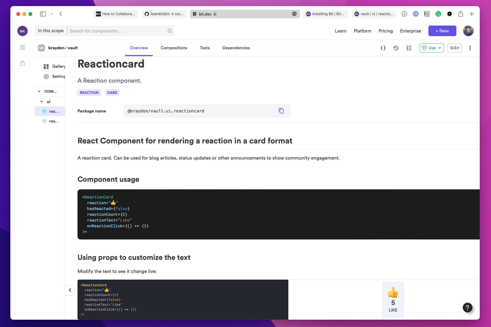
Documentation for a reaction component I've created for my revamped blog.
The documentation site is extremely handy! Each component comes with its own dedicated document page that includes component usage, component compositions as a display for various component states, a list of properties the component is expecting (with prop type, default and description included) and a page dedicated for the component’s supporting unit tests.
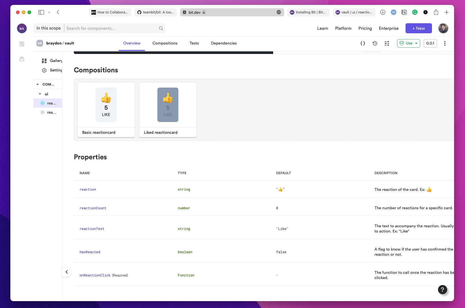
Bit comes with compositions and component properties out-of-the-box!
Bit comes with its own version manager, the BVM.
In order to work on Bit components, you’ll need a local workspace. Bit makes this trivial. You can work on Bit components in a preexisting project, or you can initialize a new workspace using the bit command.
Once a workspace is initialized, components can be generated using the bit create command. Components are scoped to a namespace, allowing them to be self-contained and independent from any specific codebase, and be properly targeted for export.
Bit allows you to tag and version components natively. This is extremely powerful and reduces the friction between consuming teams when you push updates to a specific component or library.
In order for teams to use components you create, they need to be exported for consumption. Bit.dev is a component cloud solution for hosting and collaborating on Bit components. It’s free and offers premium options for teams. You can also publish components directly to NPM if that’s more your style!
It’s extremely easy to get up and running with your first Bit project!
Feel free to read the official documentation, create your first component and publish it to Bit.dev!
If you prefer to watch a video walkthrough, check out this video by Debbie O’Brien!
Our community has grown to accept and promote component reusability, but restrained to the scope of the project they’re working in.
Yes, components should be autonomous, modular and crafted in a way where they can be used in a wide variety of situations. But they should also be reusable across multiple projects! Let’s redefine and maximize component reusability!
Articles delivered to your inbox!
A periodic update about my life, recent blog posts, how-tos, and discoveries.
As a thank you, I'll also send you a FREE CSS tutorial!
No spam - unsubscribe at any time!