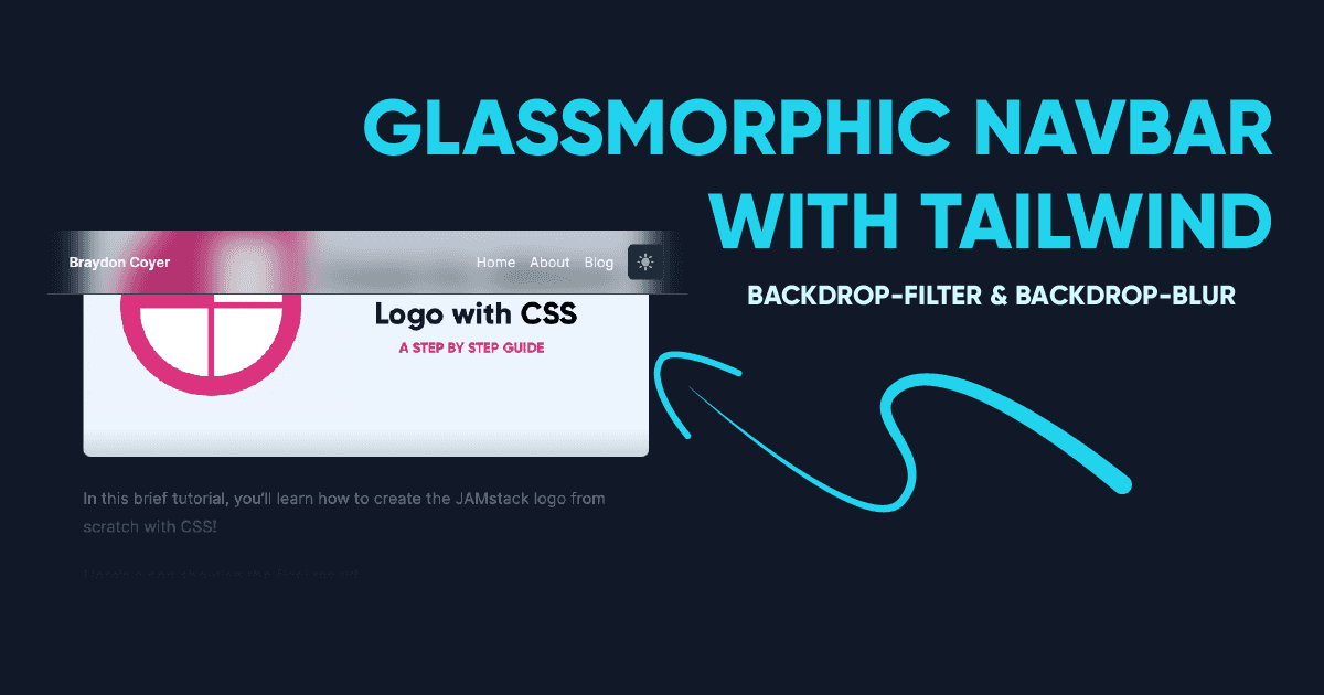
Build a Glassmorphic Navbar with TailwindCSS backdrop-filter & backdrop-blur
Braydon Coyer / April 22, 2021
6 minute read
•
--- views
Glassmorphism, a design trend that spiked in popularity in late 2020, is a methodology where a background-blur is applied to an element, giving it a sense of translucency and distinct perspective from its surrounding elements.
While the design trend has only recently gained traction, it is something we’ve seen before, even in widely used systems (I’m looking at you, Windows Vista). What's old is new, I guess.
I'm all for trying new things and one of the things I did over the weekend was utilize the new backdrop utility classes in TailwindCSS v2.1 to give my website's navbar a frosted glass feel! It turned out so well, I thought I’d show you how to make this yourself! Check it out!
CSS filters weren’t supported by Tailwind in the past but with the release of v2.1, a bunch of handy utility classes are now available for us to use, including the new backdrop-filter classes!
In order to achieve the glassmorphic effect on the navbar, we only need to utilize the backdrop-filter and backdrop-blur utility classes, and adjust the opacity a bit. It's dead simple!
Before moving forward, make sure you have Tailwind v2.1 installed!
Let’s start by using the ‘nav’ semantic element and populating it with a few items.
1<nav>2 <div>3 <div>4 <span>My Logo</span>5 <div>6 <a href="#"> Dashboard </a>7 <a href="#"> About </a>8 <a href="#"> Projects </a>9 <a href="#"> Contact </a>10 </div>11 </div>12 </div>13</nav>Before we apply the glassmorphic effect, let’s style the navbar so it actually looks like a navbar.
1<nav className="sticky top-0 z-10 bg-white">2 <div className="max-w-5xl mx-auto px-4">3 <div className="flex items-center justify-between h-16">4 <span className="text-2xl text-gray-900 font-semibold">Logo</span>5 <div className="flex space-x-4 text-gray-900">6 <a href="#">Dashboard</a>7 <a href="#">About</a>8 <a href="#">Projects</a>9 <a href="#">Contact</a>10 </div>11 </div>12 </div>13</nav>A lot of these styles are self-explanatory, but let me hit on a few things:
- The nav element has a background-color applied to it. If there is no background-color, the filter classes won’t have anything to blur!
- The nav element is sticky - there’s no point in giving the navbar a glassy feel if we don’t see it when we scroll down the page!
- A z-index is applied to the nav, just so other elements don’t break the illusion.
At this point, the navbar should look something like the above picture. If you scroll down the page, it should stick to the top of the screen. Nice!
Now that the structure is there, let’s add the magic. ✨
Add the backdrop-filter and backdrop-blur-lg utility classes to the nav element.
1<nav className="... backdrop-filter backdrop-blur-lg">...</nav>If you scroll down the page at this point, nothing seems to have changed. Although the utility classes are at work, we need to adjust the background-opacity of the navbar for them to be revealed.
The lower the background-opacity, the more content shows through the element. Feel free to play with the value a bit. I've add the bg-opacity-30 class to my navbar.
1<nav className="... bg-opacity-30">...</nav>The navbar now has a glassy feel, and adds a cool effect without taking too much away from the user’s experience on the website. We could stop there, but there’s one more thing we could do.
As it stands now, the frosted glass navbar can be hard to distinguish from the background of the website.
Adding a slight bottom-border allows the harsh color to contrast the blurry background of the navbar, visually identifying the end of the element. It’s subtle, but adds a whole new layer to the overall presentation.
1<nav className="... border-b border-gray-200">...</nav>Great job! We've now added all of the styles required to achieve the glassmorphic effect on the navbar!
But, if you’re testing your changes on multiple modern browsers, you may have noticed a bug...
That’s right. If you preview your changes on Firefox, you’ll see that the blur doesn’t show up at all.
Turns out, Firefox doesn’t support CSS backdrop-blur. So what’s the workaround?
Thankfully, Sam Selikoff posted a custom variant he wrote on Twitter. The variant targets users who are using Firefox so that we can increase the opacity of the navbar only on those devices.
Open the tailwind.config.js file and add the following code under the plugins property.
1const plugin = require('tailwindcss/plugin');2
3module.exports {4    ...5    plugins: [6        ...7    plugin(function ({ addVariant, e, postcss }) {8      addVariant('firefox', ({ container, separator }) => {9        const isFirefoxRule = postcss.atRule({10          name: '-moz-document',11          params: 'url-prefix()',12        });13        isFirefoxRule.append(container.nodes);14        container.append(isFirefoxRule);15        isFirefoxRule.walkRules((rule) => {16          rule.selector = `.${e(17            `firefox${separator}${rule.selector.slice(1)}`18          )}`;19        });20      });21    }),22  ],23}
Now head back to the navbar and include the following class:
1<nav className="... firefox:bg-opacity-90">...</nav>Although the navbar isn’t blurred, the opacity is bumped up a bit but still maintains the translucent effect.
While it can be tempting to build out entire user interfaces using this design fad, please note that it has accessibility concerns due to its translucent nature.
If you use glassmorphism, use it sparingly.
For more information on a accessibility best-practices with glassmorphism, read this article by Aimee Liang.
As I was updating my website’s navbar last weekend, I noticed a problem similar to the Firefox issue but when viewing the website on Safari (and all of my mobile devices). After hours of debugging and looking on the web, it turns out I didn’t have autoprefixer installed or configured in my postcss.config.js file, so the appropriate vendor prefixes weren’t being added to my elements. Oops!
TailwindCSS continues to improve and with the release of v2.1, many CSS filters are now supported with associated utility classes.
Thanks for reading!
If you enjoyed this article, consider signing up for my developer newsletter!
If you’d like to keep up to date with me on a daily basis, follow me on Twitter!
Articles delivered to your inbox!
A periodic update about my life, recent blog posts, how-tos, and discoveries.
As a thank you, I'll also send you a FREE CSS tutorial!
No spam - unsubscribe at any time!